
Webinar presenters Kelle O'Neal and John Ladley tackled the data viz topic from a variety of angles, kicking off the conversation with a poll that asked https://www.firstsanfranciscopartners.com/leadership-team/kelle-oneal/how many of the audience members were actively using data visualization (or their organizations were). The majority of our audience said they were using it actively or just starting to experiment with it.
More than a quarter of respondents also shared that data visualization is already adding business value by helping their organizations spot trends and enabling more data interaction, among others.

The Data Insights & Analytics series webinar presenters are Kelle O'Neal and John Ladley from First San Francisco Partners.
Data Visualization Benefits
Kelle and John reviewed the benefits for data visualization, which include:
- Helps you understand large amount of data
- Explains findings easily and more quickly
- Clarifies areas of importance or required action
- Allows you to discover and understand trends, patterns and correlations
- Improves recall of information
- It's more interesting and engaging!
... and data visualization best practices:
- Know your audience. What do you want to communicate and/or what problem are you trying to solve?
- Keep it simple. Visualizations should be easy-to-comprehend, yet still meaningful.
- Tell a story with the data. Good stories have a structure and flow; think about the set-up and conclusion.
- Exploit technology and types. Choose the right data visualization type for your purpose.
- Document data sources, collection method, timing, etc. Grow understanding and impact by providing the full context.
Data Visualization Tools and Examples
Our Keys to Effective Data Visualization webinar also included a look at leading tools and software — some free and some costing $25–$75 (per month and per user), including Tableau, QlikView, FusionCharts and Highcharts.
New tools become available almost every day, and many offer a free trial period for experimentation. We hope this webinar inspired our audience (and you) to explore the benefits of using data viz to bring more meaning to your data!
Data Visualization Webinar Recap
There's more to this month's data viz story than we shared here, including how organizations need to standardize and "harmonize" data before it's ready for visualization. You can view the presentation material on SlideShare and/or listen to the session recording in DATAVERSITY's webinar archive. (Hint: One of the benefits of viewing the material is you'll see a helpful resource we discovered that lets you view dozens of data visualization types.)
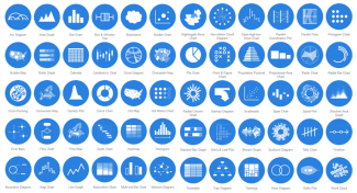
The options are nearly endless, thanks to the variety of data visualization formats available. (Graphic courtesy of datavizcatalogue.com.)
Up Next Month, We're Talking Trends
Our popular DATAVERSITY webinar series ends the year with an exploration of what's trending in information management — the opportunities and potential obstacles for 2018 related to people, technology, data and processes. Join Kelle and John for the Trends in Data Analytics webinar on December 7.
Want to stay in the loop on future FSFP webinars with Kelle and John? Let us know!